[Case 02]
Oh Shirt Yeah: Designing a responsive website
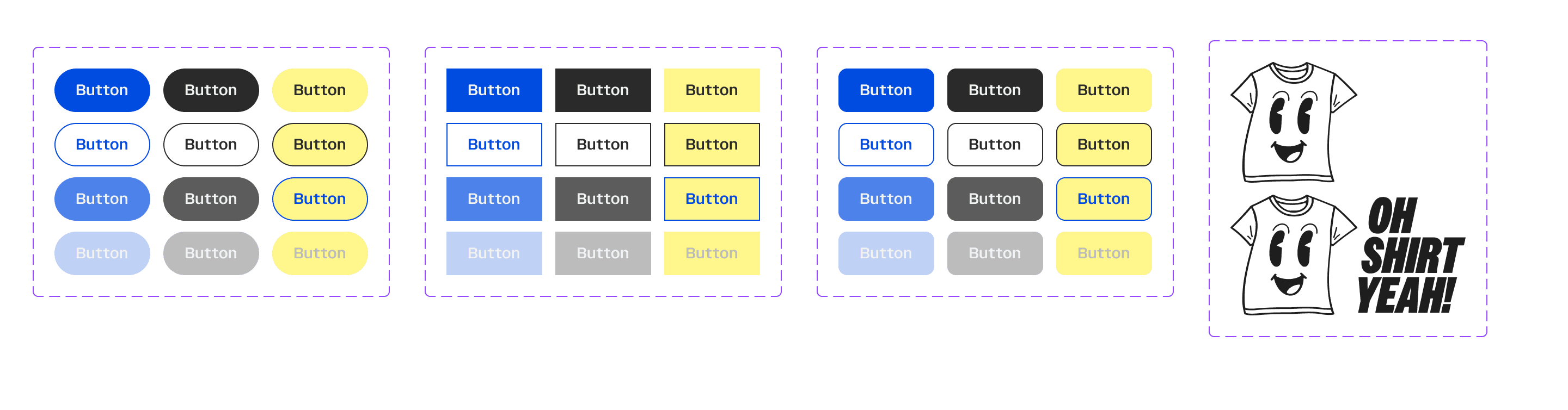
Responsive Web Design

Revamping the order flow of a custom apparel business.
Creating clarity for customers and ease of use for the business.
[Project Overview]
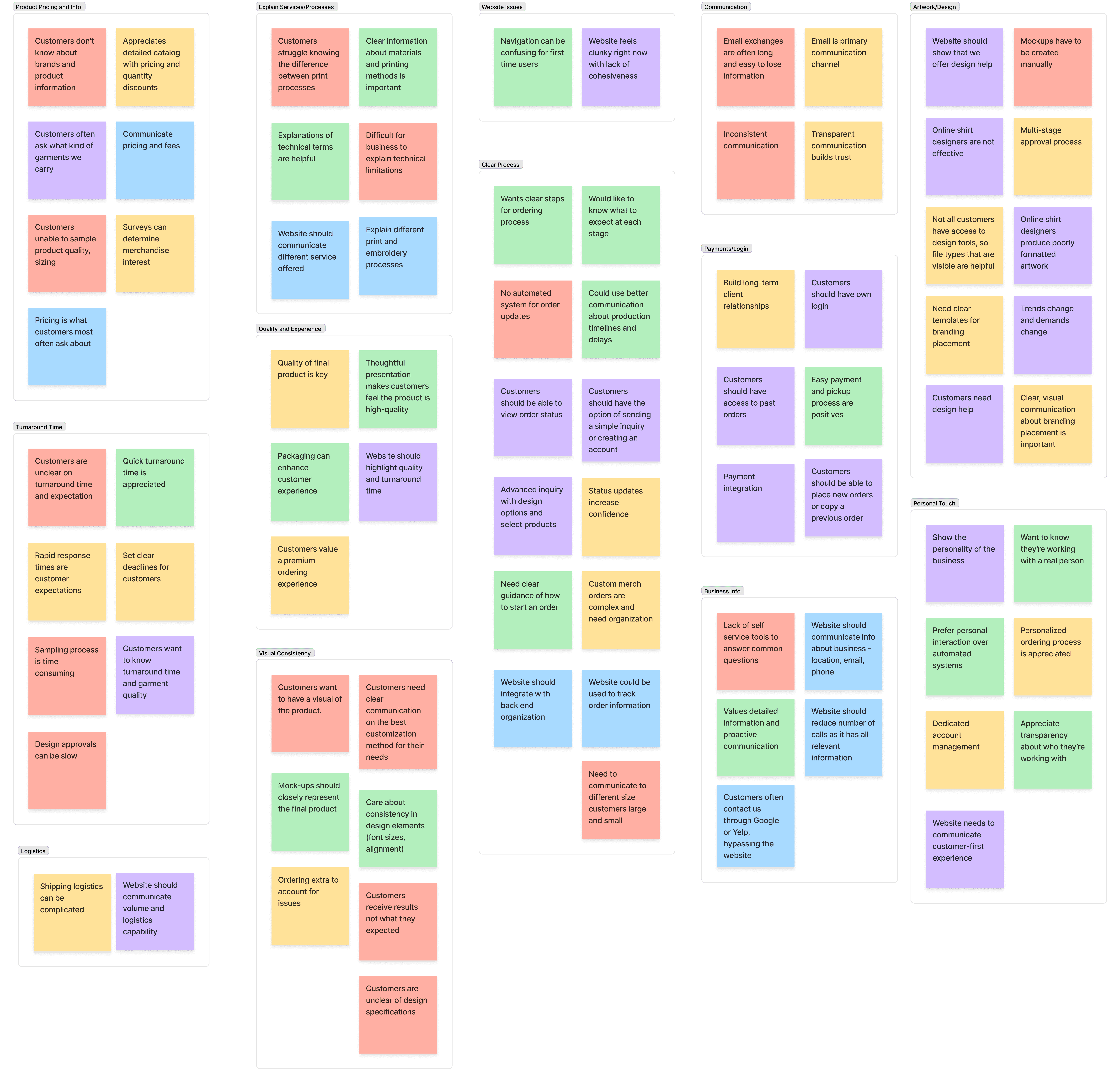
This project hit close to home. As my former employee of 7 years, I was well aware of the challenges of creating an ordering system that would reduce friction for customers. With all the variables of custom apparel: style, brand, color, size, there is a lot of data to parse through.
In doing so, I had to remove my personal biases given my history with the business, and go straight to customers of Oh Shirt Yeah, as well as of other apparel companies to gain insights.
The fact of the matter is, shirts can be a messy business. My goal was to help clean that up.
[Type]
Responsive Web Design
[My Role]
Product Designer
[Platforms]
Web Design
[Timeline]
6 Weeks
[Process]
[Persona]

The Casual Customizer
Marketing Manager
This persona is an individual who needs to place a small custom apparel order, whether it be for a family reunion, work event, bachelor party, or a kids sports team. They generally don’t know much about custom apparel, design, or ordering. This persona requires a bit more hand holding. They usually have a vision in mind of what they’d like, but need the business to help them realize that vision.
[Goal]
Turn their idea into a reality
Complete their task as soon as possible
Gain an understanding of how to order in the future
[Frustrations]
Confusing processes
Lack of updates
They may be technologically challenged

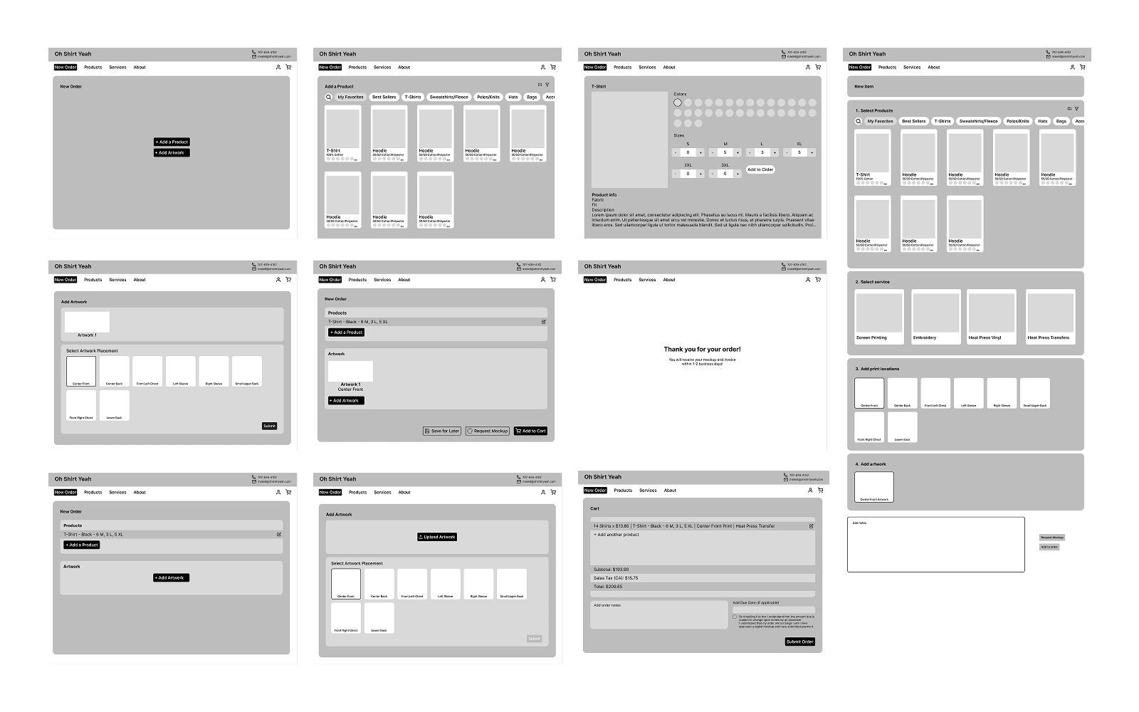
[Low-Fidelity Wireframes]
[Outcomes]
Satisfied business owner with development of the site in progress
User testing participants reported feeling more confident navigating the site.
The final design was not only more usable, but more representative of the company itself.
[Final Mockups]

[Key Learnings]
[What's Next]
As we progress with building a new Oh Shirt Yeah site, my plan would be to make the home page a little bit more aesthetically pleasing, in order to catch the eye and draw users to the order flow.